Tuesday, December 4, 2018

Mostly White

Break time is over! After a couple of months when my creativity hijacked by a kitchen remodel that took way longer than I expected, I'm back at my craft table and making Christmas cards! This week I'm playing along with AAA Cards CAS Game "Mostly White," a design theme I really love. Had fun trying out some new Christmas dies.


For this one I used two Simon Says Stamp designs, Merry Dies from CZ Designs and Corbel Ornament Collage. I made the background using a partial emboss technique with one of my older Cuttlebug embossing folders after running the dies through. I popped up the embossed section with double-stick foam tape, then filled in the ornament die cuts using a Gelly Roll glitter pen. I stacked four die cuts of the word Merry and glued them together, then mounted them inside the die cut space letterpress-style.

 The picture below shows the glitter on the ornament a little better.


Saturday, September 8, 2018

Peek-a-Boo Cards


Still playing with apples and the AAA Cards sketch! I wanted to try a different take, this time using a diecut technique. With my MISTI, I stamped the image twice using Versafine onyx ink, once on the front and then on the inside. The great thing about the MISTI is that I know the image will be in the same spot on both sides of the card. That is, as long as the inked-up stamp stays in place when the MISTI is closed. This particular stamp was once a rubber stamp, which I had removed from its wood block, delaminated, and treated with a tacky glue so it could be used like a clear stamp. 


Unfortunately, the tacky glue wasn't as tacky as it once had been. After several attempts to stamp during which the stamp fell off and made a near-perfect impression on a spot where I didn't want it, I figured out that I could carefully close the MISTI back-to-front, very slowly, and hit the right spot. I used one of the mistakes to practice my watercoloring. It actually turned out kind of artsy looking, in spite of my ineptness, don't you think?

Next, I diecut a small circle in the top card, then colored only the inside image with colored pencils. The result is that you see the image with color in the center fading to black and white on the outside. The images do line up; it's difficult to tell by the photo without the card being completely flattened. 

Before adding the sentiment, I did a partial emboss on the front using an embossing folder with my Big Kick, to give it texture.


I made a second card using the same technique with black, white and one other color for the current Less Is More challenge.


I've been anxious to try out this cute stamp from Gerta Steiner that I've had all summer. This seemed the perfect challenge! Once again, I stamped both front and inside with Versafine then heat embossed with clear powder. This time I colored the image with alcohol markers. For texture, I ran the front cover through my Big Shot with an embossing folder from Stampin' Up, Softly Falling.


For a little bling, I added a bit of glitter pen to his hat and nose.


Just to show that I really can read directions, I made this design with the white space non-textured for the AAA challenge:


Thanks for stopping by!


Wednesday, September 5, 2018

Apple Play


I made this card for a new challenge over at Addicted to CAS and one of my favorites - Apples! 


I'm also going to add this to the sketch challenge at the AAA blogspot. 

 
My design idea had me reaching back into my stash for one of my oldest stamp sets from Stampin' Up. I knew I wanted to use my colored pencils on kraft paper, so I chose a nice kraft cardstock from GinaK for the base. I stamped the apple with Vesafine Onyx ink and heat embossed it with clear embossing powder. To keep the design simple and have the color of the apple stand out, I decided to stamp the leaf and sentiment in Versamark, embossing both with the clear embossing powder.

Once that was done, I die cut the base using the largest Page Maker rectangle die. For a extra texture I ran it through my Big Shot using a Sizzix plate, also from my stash archives. For the final touch I adhered a few sparkly sequins that I received free with my last order from The Ink Road (who doesn't like "free?").


Thanks for looking!


Thursday, August 30, 2018

Cubes

Still in the playing mode, I made a card for Less is More's #378, Sketch 24. I struggled a little with this one for several days because I just couldn't get the spacing right. My first attempt produced this card:


I really wanted to create a card like some that the design team had made. Anita's was my favorite, so I went to her blog and studied. The result was my second card, which is all but a blatant plagiarism of Anita's (or shall we call it an innocent CASE?).


I'm glad I was able to squeak in before the deadline on this because. . . 


Thanks for looking!

Berries and Boxes


After several disappointing results using the only berry stamp I own, I was ready to give up on making a card for Addicted to CAS's Challenge #143, Berries. However, I happened to notice that another project I'd rejected, a watercolored hydrangea, had a very cool leaf that I hated to throw out. One thing led to another. I cut out the leaf using a square punch, then stamped one more strawberry with my old rubber stamp, this time on watercolor paper, and punched that out too. I mounted both with foam tape on an embossed card front, then added a sentiment. Voila! I had a "Berries" theme card and I was happy because...

Grab our Badge!

Monday, August 27, 2018

Mermaid Dreams


 There's something about a rainy day that gives me permission to create cards! Not that I need permission (retirement is awesome) but this sunny, warm summer has just beckoned me outdoors and away from my craft studio. So, yesterday's rain just sat me down and got me back into the groove.


For inspiration I decided to participate in a couple of CAS challenges, beginning with AAA Cards' Game #122, Use a Stencil. One of the cards on my to-do list is a birthday card for our six-year-old granddaughter, who's into princesses and mermaids. 


Her card ended up being just a little too gaudy for CAS, I thought, so I created a couple versions that were more fitting.


I began with a mermaid scale stencil I had made earlier this year using my Cricut and a Google image. Here's the link to the Ken's Creations video that taught me how to do it. With Distress Oxides in Mermaid Lagoon (naturally) and Seedless preserves, I created a swirl to suggest a mermaid tail. Then I showered it lightly with shimmer spray. 

Next, I stamped the sentiment with Gina K's new archival black ink along with the tail. The sentiment if from Sunny Studios and the tail from Flora & Fauna. I added a little heat embossing to the tail using a powder from my stash called "Psychedelic." You can catch a little of the shimmer in the photo below.


To add texture, I used an embossing folder from Darice across the bottom corner, simulating waves. After adding a few bubbly embellishments, I diecut the frame using Crazy-Double-Running-Stitch-Rectangle-Nesting-Dies from Cutplorations, then adhered the whole thing to a card.

I created the version below the same way, only using Versamark with the sparkly embossing powder. The mermaid tail came out in a pale, shimmery gold. This one I mounted with foam tape to make it pop out a little.


All in all, even though I began the whole process wondering if I'd get inspiration I like the way these turned out. I guess the secret is to just begin and the inspiration will come!

Thanks for looking.

Supplies used:


Wednesday, August 15, 2018

Friendly Watercolor Sunflower


Playing along with a couple of CAS challenges today, AAA "Friendship" and CAS Watercolor "Sunflower."


I reached back into my stash for a cute little sunflower stamp that I've had for years, from Stampin' Up's "Give Thanks" set, which is long retired. Such a cute set, though, and worthy of pulling out of retirement.

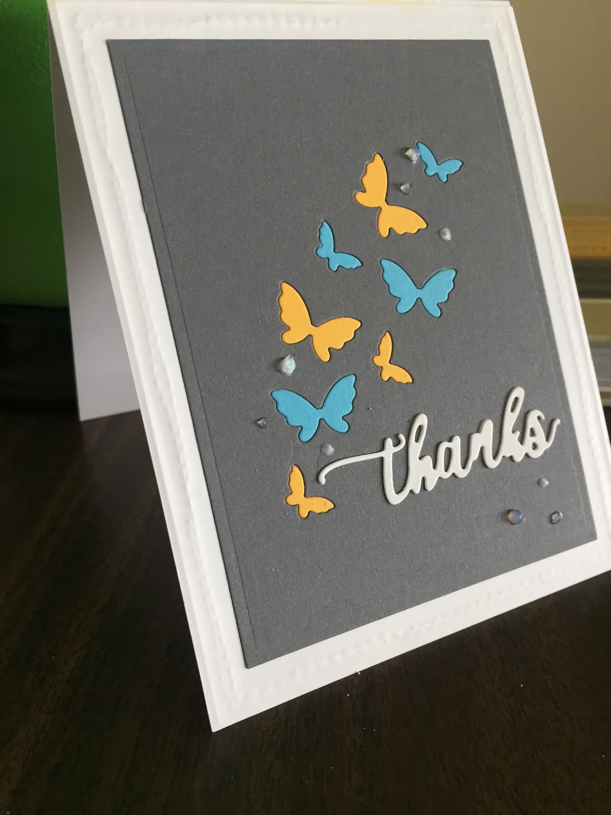
I began with a simple watercolor background on 400 watercolor paper. Next, I stamped the sunflower using Gina K's new archival ink. When that was dry, I used my watercolor markers to color in the sunflower, then diecut the design using a circle. With a larger circle I embossed the frame, and cut another frame using Spellbinder's page dies. I added a few crystal drops, and mounted the smaller circle into the embossed circle.

The sentiment is from Gina K's hydrangea set. I stamped it using Versafine onyx ink, then embossed with clear embossing powder. 

Please see below for links to the products I used and check them out.


Thanks for stopping by!

Products used (some are compensating affiliate links):


Thursday, July 19, 2018

Olive and Tangerine


Playing along this week with the Less is More blog challenge using the colors Olive and Tangerine. I love this combination and was excited to experiment with different design ideas.


For my first card I used Distress Oxides in both Peeled Paint, for the Olive color, and a blend of Spiced Marmalade and Candied Apple to get a rich Tangerine. The leaves are from The Ink Road as are the sparkly embellishments. I stamped the Happy Birthday sentiment, from Simon Says Stamp's CZ Design All Caps set, with white embossing powder on black cardstock. The Friend die is from My Favorite Things, cut from green card stock and embellished with a little touch from my Gelly Roll glitter pen. I die-cut the frame and mounted it on my card using double-stick foam strips to add dimension.

Wednesday, June 6, 2018

Graduation Season

Made a couple of quick graduation cards using die cuts, patterned paper, and large-format cards.


I was really excited to use the Moda Scrap 6x6 Fly and Scrap papers that came with the Simon Says Stamp May kit, particularly this one with the village buildings and colorful balloons. In order to use as much of the scene as possible, I decided to use a 5x7 card. That size also allowed me to position the die cuts the way I wanted.


The die cut sentiments are from My Favorite Things. After cutting them from the printed paper, I cut another layer of white and glued them together with my glue pen. After I had them fully adhered, I was a little disappointed that they didn't have enough depth. Too late to peel them off and add another layer! Instead, I traced the letters using a Zig Clean Color Real Brush marker in Cool Gray. Not completely thrilled with the result, so the next card I made got three layers instead of two on the sentiments. 

I filled in the open parts of the letters with my  Gelly Roll Pen, rather than let the off-white of the card show through. The embellishments are 4mm clear droplets from Pretty Pink Posh


For my second card I used the other parachute-themed paper in the kit, added three rather than two layers on the die cut sentiments, and added a border using the cover paper (which shows a sample of each sheet in the package) to the top and bottom. Finally, I added the word "Grad" in freehand letters using my Versamark Watermark pen and white embossing powder.

Simple and quick!

Thursday, May 31, 2018

Belated Birthday

Is it even possible that someone who spends time every day making and sending cards would even need a belated birthday card? I'm here to tell you that the answer is "Yes!," particularly when I'm that person.

The busy birthday months in our family gain speed in the spring, so it's understandable that, just when I thought I'd remembered everyone's big day I saw my niece's Instagram post of my brother-in-law blowing out birthday candles. The last May birthday of the season, which I had totally forgotten!

My mind immediately went into card-creation mode, this time geared for a belated greeting. What came to mind was an idea featuring some critter facing backward with the caption, "Just a little behind." My stash included the critter, a cute bunny from Lawn Fawn's Upon a Star set which is what I used. The sentiment I had to write myself. I used my Kuritake Fude brush pen.


The challenge was creating the background, so I kept it simple. Using Altenew's Grid Stencil and Distress Oxide ink, I applied a green background with a blender sponge. For the sky I created a mask with a circle die, then applied Distress Oxide ink in blue.

I stamped the bunny using Ranger Archival Ink  in Jet Black then added some little pink cheeks with Copics before diecutting. I attached the bunny with adhesive squares for added dimension.


Inside the card I used a greeting from another Lawn Fawn set, Party Animals and inserted the word "belated" between Happy and Birthday.


Thanks for looking!

Supplies used (some compensated affiliate links included at no cost to you):


Wednesday, May 23, 2018

Inlay Technique


A few days ago I noticed I was very low on Thank-You cards, so I decided my next challenge entries would be Thank-Yous. This card is for the Less is More challenge, using the colors yellow, blue, and gray.


After seeing very cool cards by Cathy Zielske https://www.cathyzielske.com/images/2018/05/SpringHasCome2800.jpg, among others, for the Simon Says Stamp blog hop, I wanted to try my hand at the inlay technique. I've also seen it called letterpress. After die cutting an image, the cut-out pieces are glued back in place, either in the same color as the original die cut or in different colors. 

One of the reasons I chose the butterflies is because just finished a book by one of my favorite authors, Barbara Kingsolver, featuring butterflies in the plot. The book, Flight Behavior, is centered around the fictional migration of monarch butterflies from their traditional wintering spot in Mexico to a spot in the Applachians. A great read, offering authentic information about monarchs and the environment. But, I digress.

I made three cards, each with a different background: gray, buff, and white, then mounted the die cut on white cardstock and glued the cut-out pieces to each using my Quickie Glue Pen . For the various colors I used blue, yellow, orange, and gray. 


I just love how the inlaid pieces look once they're glued in!


For this version I made the sentiment a little differently, hand-lettering the Thanks and die cutting it using Cottage Cutz Double-Stitched rectangles. Then I adhered it using Darice thin foam strips.


On these last two cards, I added a layer to a single butterfly, folding it to pop up and gluing it down with a dot of Gina K's Connect Glue. And of course, a few little jewels for embellishment, Little Things Rainbow Sparkle Mix and Pretty Pink Posh Clear Droplets.


I die cut the card fronts for the gray and buff cards using my Spellbinders Card Creator. Then I embossed the white cardstock frame using Stamplorations Double Running Stitch die.
For the card above I simply cut the card front from white cardstock using my Avery Elle Double Stitch Rectangle die.


Inlay technique is fun and easy. Give it a try! Thanks for looking.

Supplies used (some compensated affiliate links):

<!-

Monday, May 21, 2018

Nature's Inspiration


The current AAA CAS card challenge, Inspired by Nature, really was a challenge for me because all of nature inspires me! Especially this time of year. You too? So for this challenge I looked to the particular part of nature capturing a lot of my time lately: my new Baltimore Oriole feeder. I spend a lot of my free time at the window, hoping for a glimpse of those fabulous orange and black birds and have been rewarded many times.


Since I don't have a bird stamp, I decided to start with just the colors, orange and black, as a basis for my card. Using a piece of Strathmore Vision Cover Stock watercolor paper, I smooshed Distress Oxide ink in Wild Honey and a little black . I threw couple slashes of black, using my Kuritake Fude calligraphy brush pen, I then sprayed everything lightly with water. My intent was to have a light background over which I would stamp either a flower or sentiment or both, and I anticipated the black slashes to bleed more than they did. However, when I looked at the result all I could see was a chubby little birdie with two legs! Not orange or sleek enough for an Oriole, but a birdie just the same. So my background became a bird.


I added a little Distress Oxide ink in Peacock Feathers for the sky area, then chose the sentiment from Simon Says Stamp's Beautiful Day set. I stamped it in Versafine onyx black then heat embossed with Hero Arts clear embossing powder.

I thought about adding a few sweeps of black to indicate wing feathers, but decided to just leave it as is. For a whimsical touch I added blue crystal jewels for eyes and an orange one to symbolize a beak. I trimmed the watercolor paper using Spellbinders A2 Card Creator die, which I really like because it cuts to just the right sizes for layering. I adhered the trimmed piece onto a Neenah Classic Crest card front, leaving a large enough margin for white space.

A little nutty, but hey, inspired by nature!

Supplies used (some compensating affiliates; I get a small commission when you click and purchase. Thanks!):